磨房户外
磨房户外


磨房户外
DESIGNER: JP YEAR: 2016 CLIENT: 磨房
Info
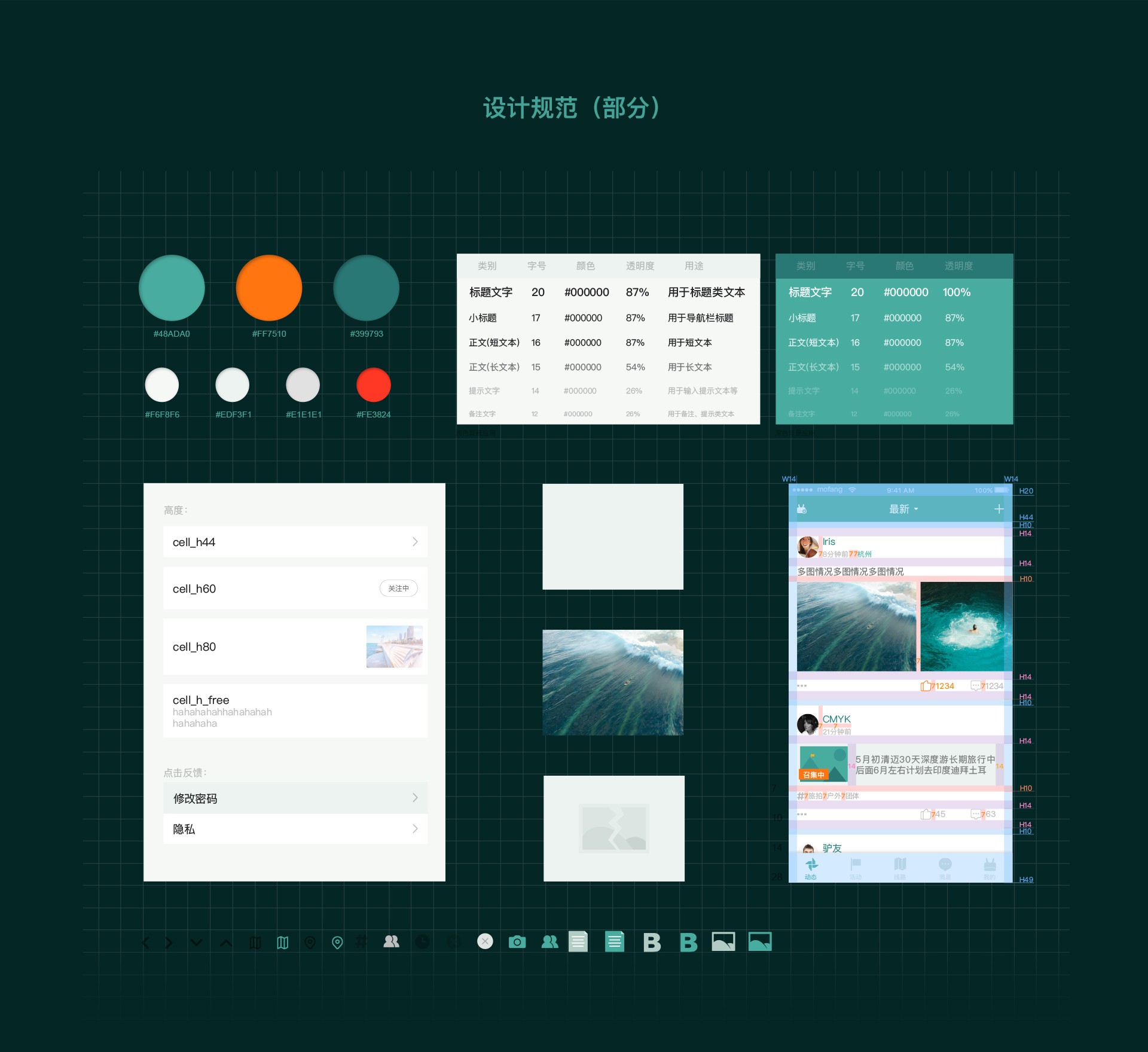
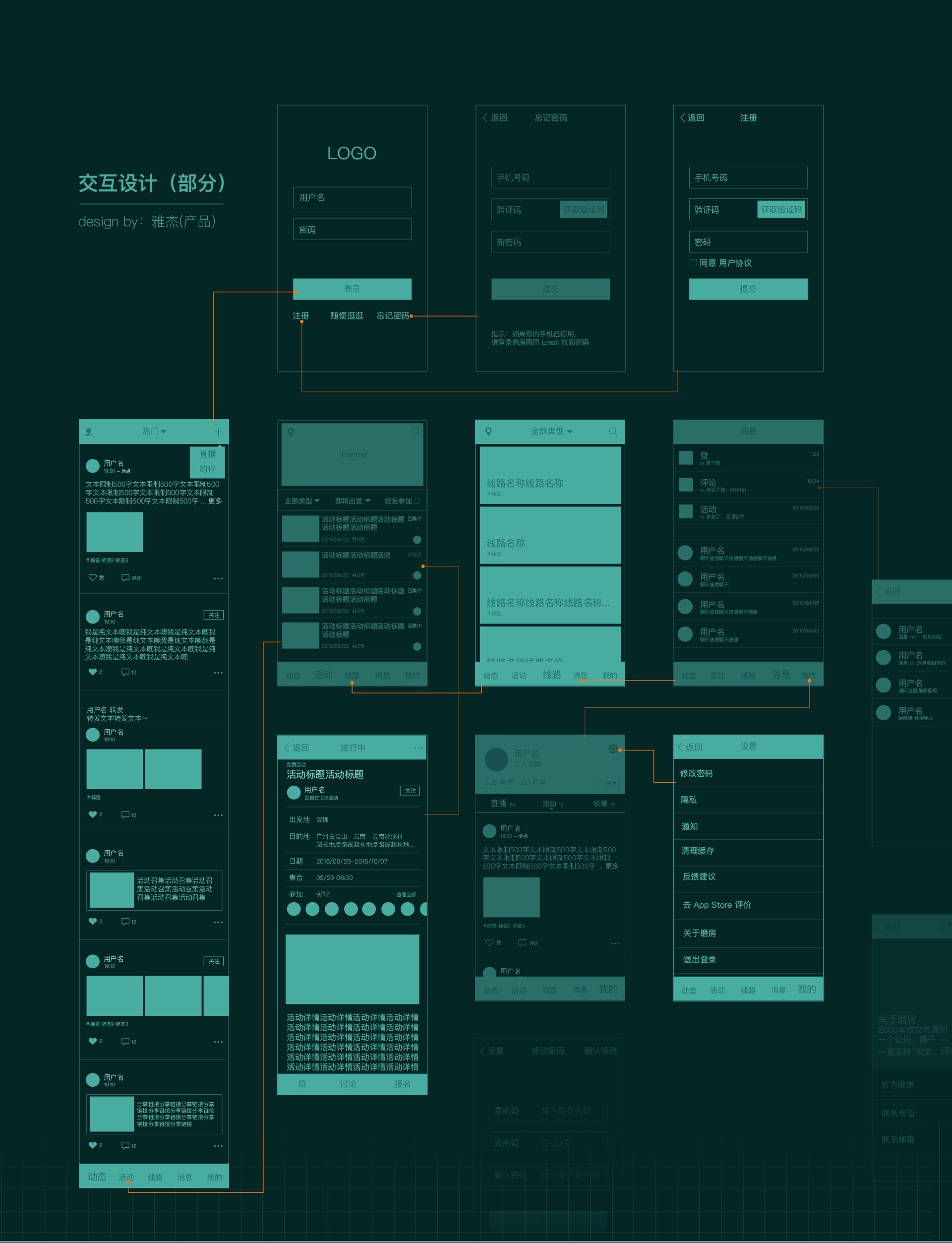
磨房在2000年成立,至今已经有16年历史,是中国著名的户外网站。推出 App 是磨房十几年来对于移动互联网趋势做出的改变,围绕户外爱好者以及磨房网的延展而设计。主要功能有:直播、活动约伴、线路推荐等。 在迭代三个版本之后我们开始着手准备设计改版,在推翻过去,也要尽量保持原有程序框架(避免开发工作量增加)是最难达到的一个平衡点。所以改版的初期目标是将 app 与 磨房品牌融合统一,以及优化体验问题。为此界面大量使用了品牌绿色,对于老用户而言这是一个亲切的颜色,对于新用户达到强调品牌的作用。另外我们去掉了很多原本元沉的视觉元素、交互,尽量做到“轻”,减少“设计”。在新旧的碰撞摸索阶段,为了更好的迭代延续以及团队协作,我们建立了视觉、交互规范文档。
Mo Fang was founded in 2000 and has a 16-year history. It is a well-known outdoor website in China. The launch of the App responds to the trend of mobile internet and serves outdoor enthusiasts, extending the scope of Mo Fang's website. The App features live streaming, activity organizing, and route recommendations. After three iterations, we began redesigning with the goal of integrating the App with the Mo Fang brand and optimizing user experience. We extensively used the brand's green color, familiar to existing users and emphasizing the brand to new users. Additionally, we removed unnecessary visual elements and interactions, aiming for a "light" and minimalist design. To facilitate better iteration continuity and team collaboration, we established visual and interaction guidelines.
磨房户外
DESIGNER: JP YEAR: 2016 CLIENT: 磨房
Info
磨房在2000年成立,至今已经有16年历史,是中国著名的户外网站。推出 App 是磨房十几年来对于移动互联网趋势做出的改变,围绕户外爱好者以及磨房网的延展而设计。主要功能有:直播、活动约伴、线路推荐等。 在迭代三个版本之后我们开始着手准备设计改版,在推翻过去,也要尽量保持原有程序框架(避免开发工作量增加)是最难达到的一个平衡点。所以改版的初期目标是将 app 与 磨房品牌融合统一,以及优化体验问题。为此界面大量使用了品牌绿色,对于老用户而言这是一个亲切的颜色,对于新用户达到强调品牌的作用。另外我们去掉了很多原本元沉的视觉元素、交互,尽量做到“轻”,减少“设计”。在新旧的碰撞摸索阶段,为了更好的迭代延续以及团队协作,我们建立了视觉、交互规范文档。
Mo Fang was founded in 2000 and has a 16-year history. It is a well-known outdoor website in China. The launch of the App responds to the trend of mobile internet and serves outdoor enthusiasts, extending the scope of Mo Fang's website. The App features live streaming, activity organizing, and route recommendations. After three iterations, we began redesigning with the goal of integrating the App with the Mo Fang brand and optimizing user experience. We extensively used the brand's green color, familiar to existing users and emphasizing the brand to new users. Additionally, we removed unnecessary visual elements and interactions, aiming for a "light" and minimalist design. To facilitate better iteration continuity and team collaboration, we established visual and interaction guidelines.


All Images & Video Copyright © JP Design Studio. All Rights Reserved.
All Images & Video Copyright © JP Design Studio. All Rights Reserved.